UX/UI Case Study
The Brief
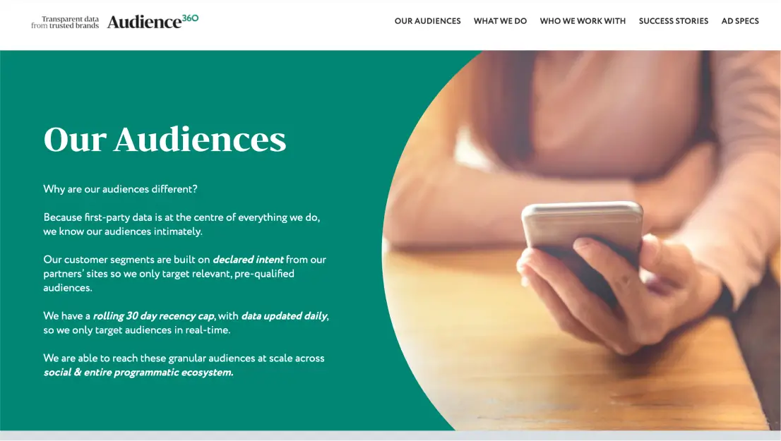
Audience360 approached us with a website that was outdated and did not reflect their brand identity, high-quality service offerings, or technological capabilities. The existing site failed to engage their target audience and did not showcase their strengths effectively.
Our objective was to revamp the website to align with Audience360’s modern brand and advanced technology while creating a user-friendly experience tailored to their audience. We aimed to design a site that not only improved visual appeal and functionality but also highlighted their service excellence and technological expertise.
The Solution
Starting with the end goals in mind, we worked backwards from Audience360’s commercial objectives. Although the company primarily relied on a single major client, our initial research revealed broader market opportunities with low competition that they could realistically target.
A keyword-research architecture informed the scope of the design and build, ensuring a website structure that offered the best chance of SEO success whilst strictly adhering to brand requirements.
The Concept
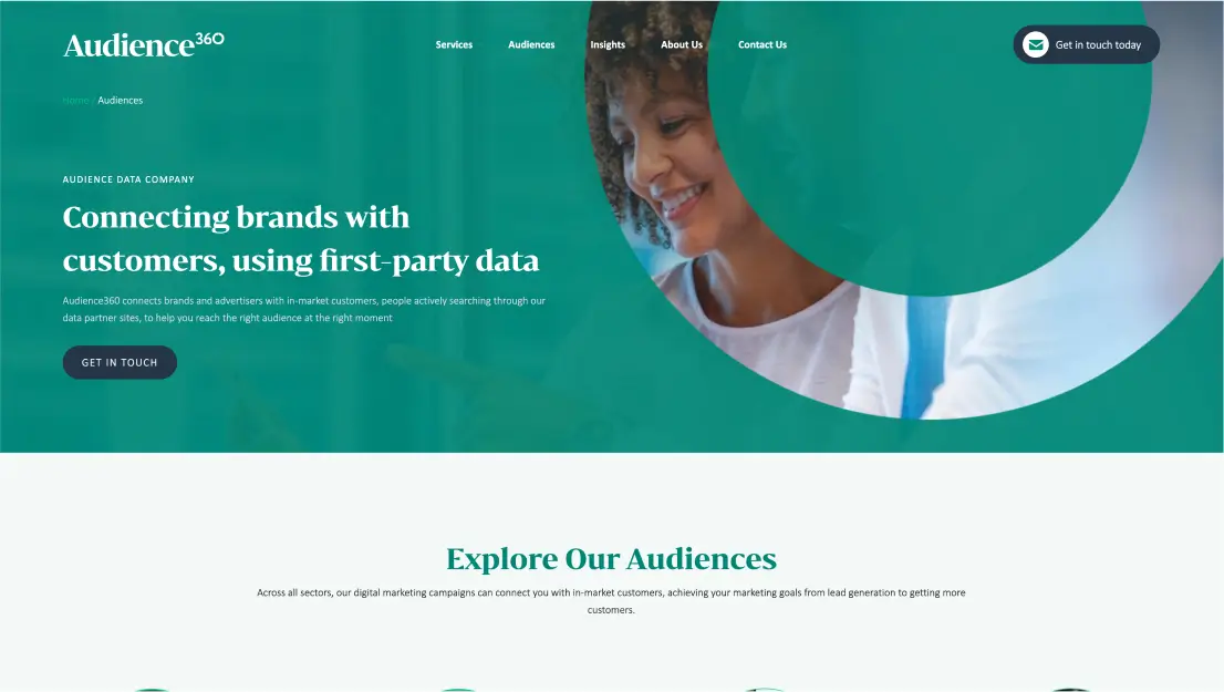
Audience360’s design uses circles to reflect the brand’s 360 concept, integrating them into backgrounds, icons, and images. A clean, well-structured layout enhances user experience while maintaining brand cohesion.
Old
New
Technical UX/UI
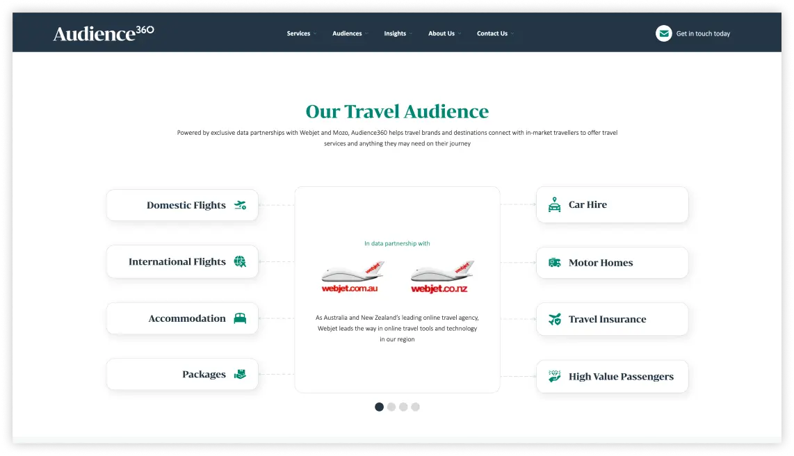
Carousel
We designed a carousel to showcase the same content across different categories, rotating dynamically to make the most of space and avoid repetition, improving user experience with interactive presentation.
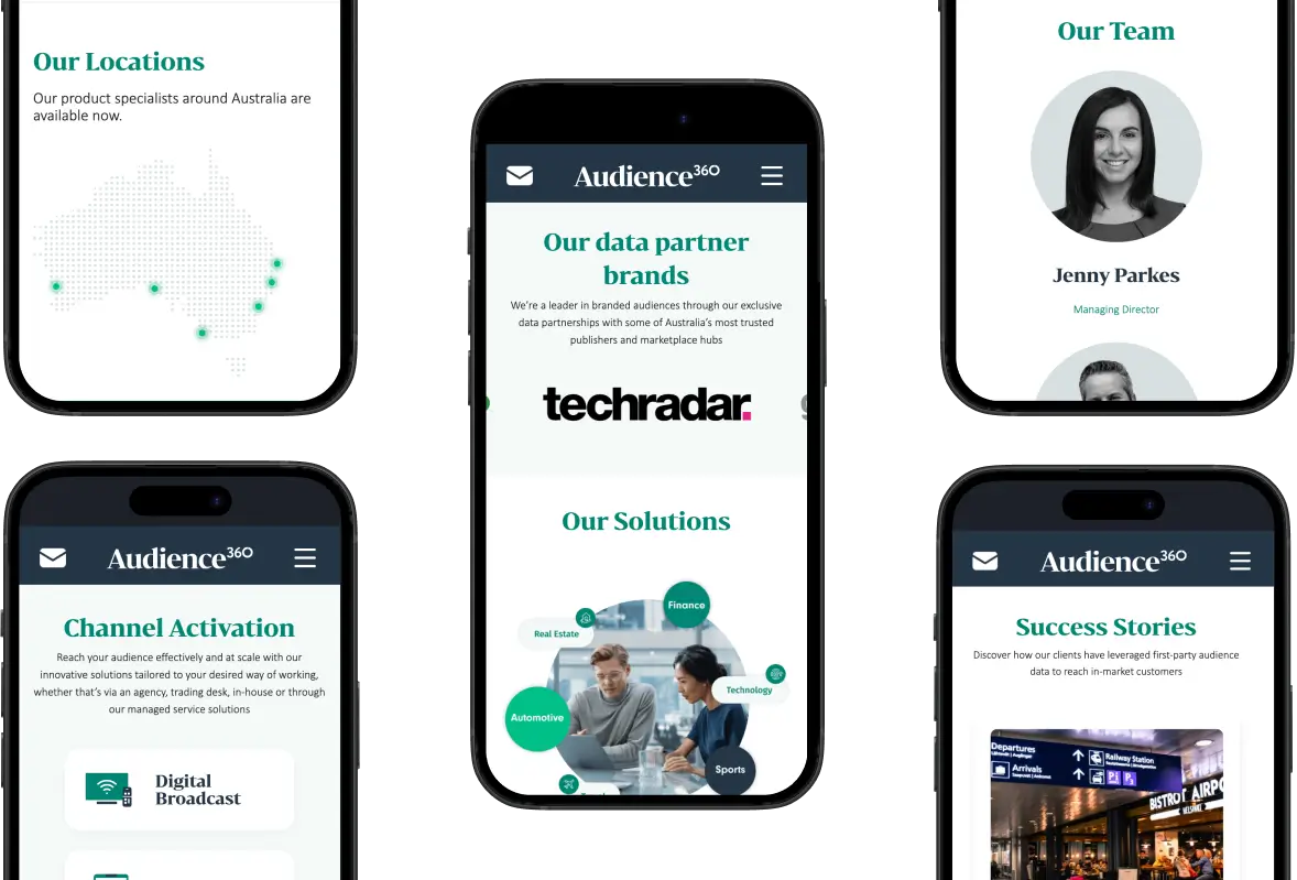
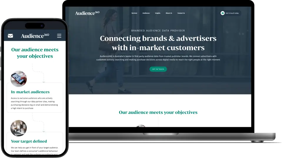
Responsive Design
The Audience360 website features a complex and intricate layout, designed to deliver a rich user experience. To ensure that this layout functions flawlessly across a variety of devices, we implemented responsive web design. This approach allows the website’s structure, images, and content to automatically adjust and scale, providing a consistent and user-friendly experience whether users are accessing the site on a smartphone, tablet, or desktop. By leveraging responsive design, we’ve ensured that Audience360’s visually complex layout remains fully functional and aesthetically pleasing on any screen size.
Search Engine Optimisation
As with most of our design projects, we started with comprehensive research into market opportunities, search landscape, and direct competitors.
This research informed the creation of a targeted URL sitemap, which guided the wireframing of each page’s information architecture and content production from an SEO perspective.
Standard technical considerations were also addressed, including header structure, metadata, Schema, site speed optimisation, and initial Google Analytics and Google Search Console configuration.
Conclusion
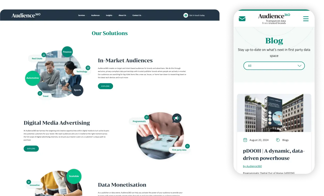
We successfully transformed Audience360’s digital presence by aligning their website with their modern brand identity and leveraging advanced design principles. Our approach—from thorough market research to a refined design system and technical optimisations—resulted in a visually appealing, user-friendly, and SEO-optimised site. The new website effectively showcases Audience360’s services and technological expertise, positioning them to better engage their target audience and seize new market opportunities.

