UX/UI Case Study
The Brief
Coastal Advice Group, a nationally recognised financial advice and wealth management company, is headquartered in Newcastle with offices in Sydney, Central Coast, Port Macquarie, and Adelaide. As they set their sights on expanding their locations and increasing national coverage, they faced a challenge in aligning their web presence with their growth ambitions.
Each location operated its own locally managed website, while the Coastal Advice Group website served as the central brand HQ. After learning of both their immediate and long-term growth plans, we were tasked with recommending a website plan that allowed for ease-of-management, both local and national SEO and paid search opportunities, and scalable website solutions to match their ambitions.
This is a challenge we truly relish—not just for the deliverables, but for the trust placed in our advice as we contribute to the future success of a growing business.
The Solution
We recommended that the Newcastle and Central Coast websites remain as standalone websites, that the Sydney, Port Macquarie, and Adelaide websites be consolidated into the main Coastal Advice Group website, with any future locations also integrating into the parent site.
The decision to keep Newcastle and Central Coast separate was purely based on the fact they were generating a good amount of new business through them, and we always approach these situations with sensible caution. If it ain’t broke, don’t fix it. The other locations, however, were either in a state of disrepair, or a long way away from becoming legitimate lead generation assets. Consolidating these sites and redirecting those domains was an easy choice.
This left us with the task of redesigning and developing three new websites from scratch, incorporating updated branding, positioning, and SEO-focused site architecture. Our builds were planned with scalability and future cost-efficiencies in mind, ensuring our work can grow alongside the client’s expanding business.
We aimed for a modern, almost SaaS-inspired design to attract younger audiences and create a website that technically outperforms all competitors in an industry where website performance is often outdated.
The Concept
The Coastal Advice Group website features a clean, structured layout that seamlessly adapts to its subsidiaries, Newcastle Financial Planning Group and Central Coast Financial Planning Group. This design maintains clarity and consistency, allowing each subsidiary to preserve its unique identity while benefiting from a cohesive look that enhances user experience and reinforces the overall brand.

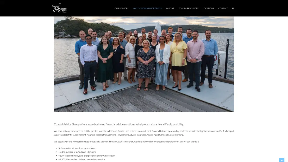
Old
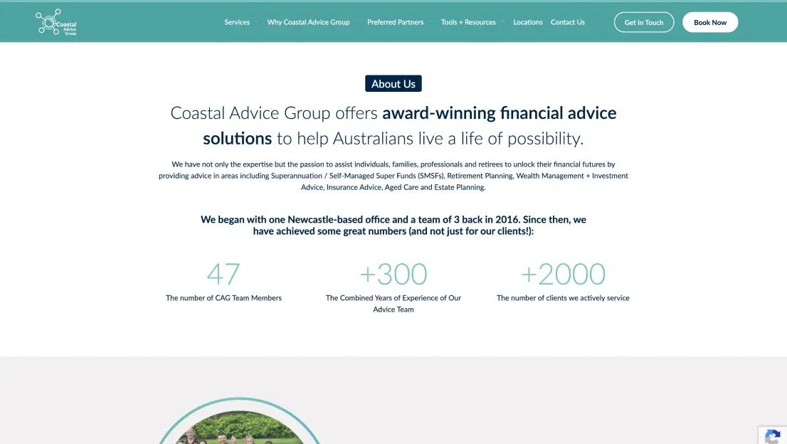
New
Design System
To enhance efficiency, scalability, and maintainability, we developed a design system that centralises the management of buttons and components. This system standardises usage, ensures design consistency, minimises redundancy, and streamlines updates across projects.
Technical UX/UI
The redesign focused on enhancing the website’s clarity and effectively communicating its purpose by prominently featuring the organisation’s core services. This resulted in a more intuitive user experience, making it easier for visitors to understand and access key information.
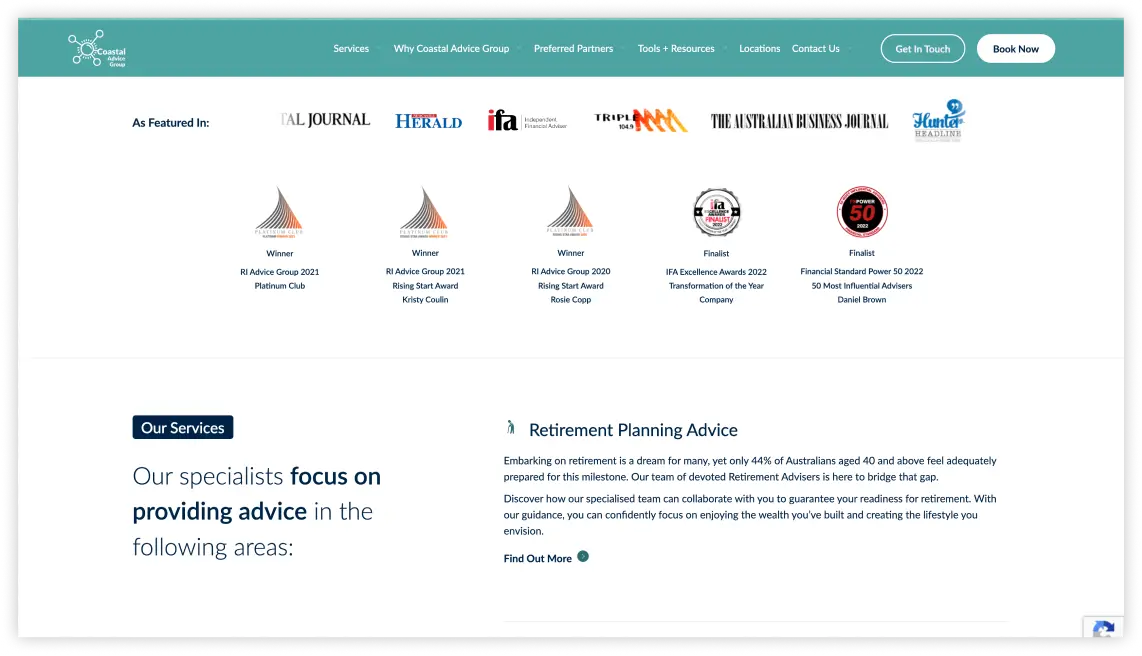
Features & Awards
The previous awards section lacked impact, so we introduced a carousel of highlights and accolades above the fold. This prime placement ensures visitors immediately see key achievements, enhancing the page’s impact and more effectively showcasing the client’s successes.
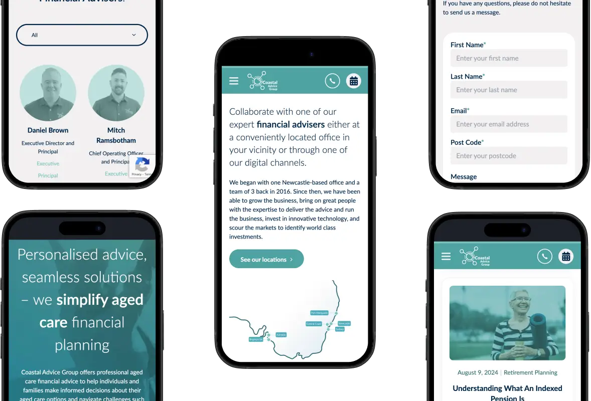
Responsive Design
To ensure smooth performance across devices, we implemented Responsive Web Design (RWD), allowing the layout, images, and content to adapt seamlessly to any screen size for an optimal user experience.
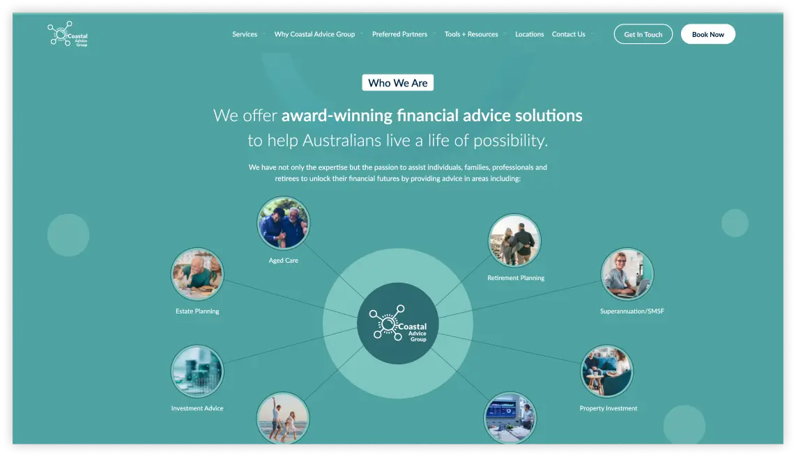
Search Engine Optimisation
Our initial SEO task was to crawl and analyse the websites slated for consolidation into the main Coastal Advice Group site, preparing for redirection mapping and implementation. We identified valuable content to migrate while discarding pieces that lacked value and weren’t worth preserving.
This led to the creation of three new website foundations, each requiring fresh keyword research and the development of targeted site architectures. We also took this opportunity to optimise all content, influencing the wireframes from which our UX/UI team could build.
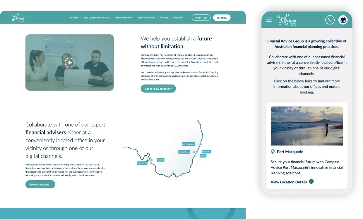
Conclusion
The redesign and consolidation of Coastal Advice Group’s websites achieved clarity, consistency, and enhanced performance across their growing network. By integrating a modern, SaaS-inspired design and optimising SEO and content, we improved user experience and search engine rankings. The new design system streamlined management and updates, while features like the awards carousel and responsive layout enhanced impact and accessibility. This project aligned the website with Coastal Advice Group’s growth ambitions and reinforced their brand identity, setting the stage for future success.


