UX/UI Case Study
The Brief
DuckRow is a disruptive startup aiming to digitise the will-making industry and promote themselves to a younger and more technologically savvy audience. The brand guidelines supplied to us were fun, bold, and engaging, and they deserved a website design that both represented their modern offering whilst conveying the professionalism required of service that produces legally binding documents.
The Solution
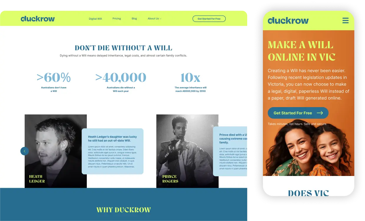
A bright, modern, and somewhat cheeky design that lightens the mood on what could potentially be a sensitive subject. Seeking to attract a younger digitally savvy audience, we designed a front-end that sought to bring the Will industry into modernity whilst being respectful of the gravity of the offering and the situation that customers might be experiencing.
The Concept
The website is for a digital will platform, but the client chose to diverge from a conventional, purpose-driven design. Instead, they preferred a more stylish and playful aesthetic, aiming for a visually engaging experience that sets their platform apart and resonates with users in a unique way.
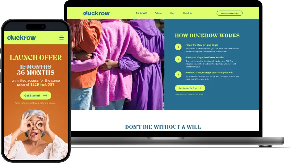
Technical UX/UI
Our clients often want intricate designs to reflect their brand, and the challenge is to ensure we provide exactly that whilst ensuring these designs enhance the user experience rather than detracting from it. The technical proficiency of the website also needs careful consideration; it’s too easy to overload a website with functionality at the detriment of performance. By carefully balancing creativity with functionality, we ensured the site remained intuitive, responsive, and user-friendly, all while meeting our clients’ high standards of design.
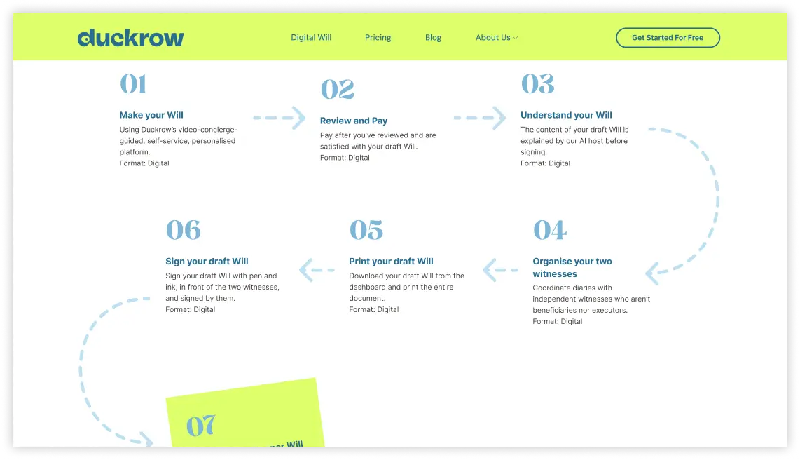
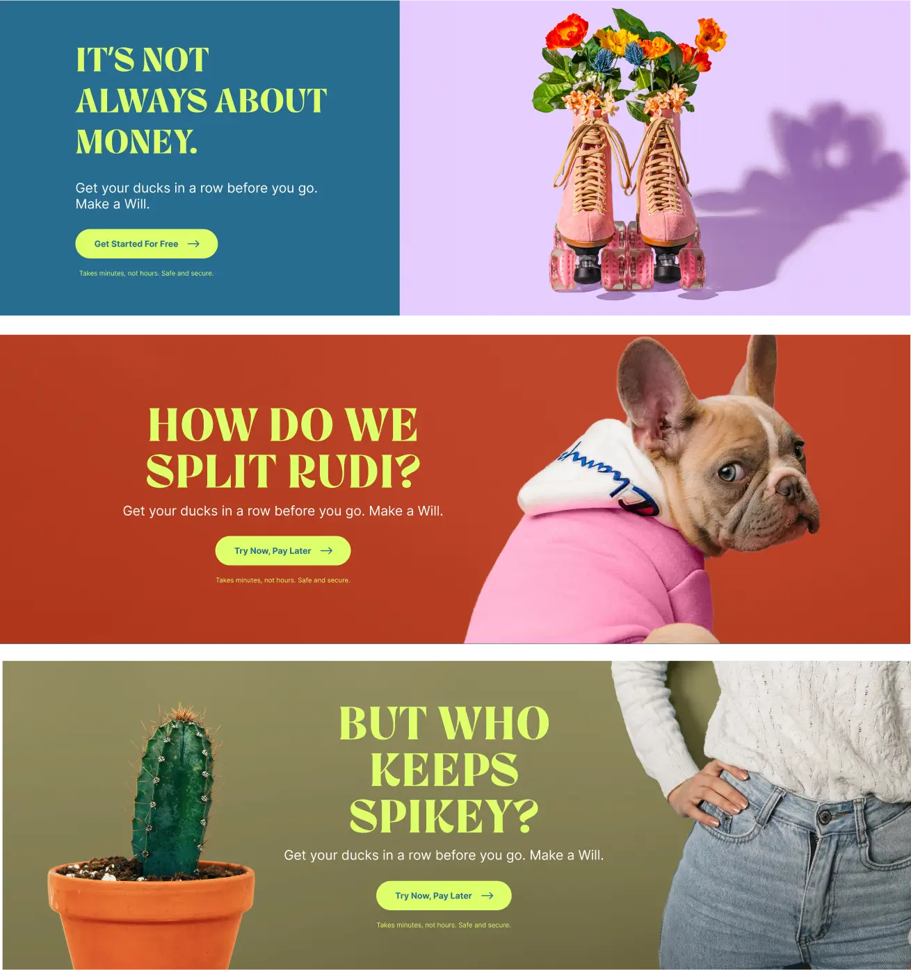
Visual Styles
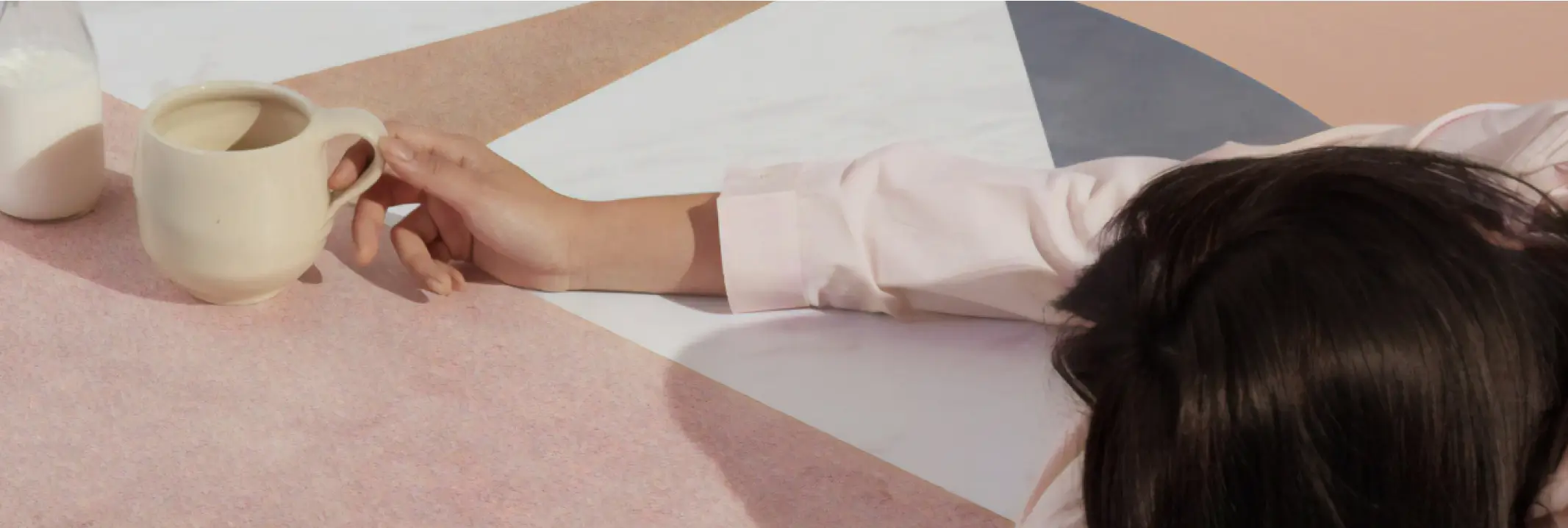
One of the most enjoyable aspects of the work was exploring their visual style, particularly the vibrant and playful elements inspired by Pop Art. The use of bold colours, striking contrasts, and iconic imagery made the creative process both exciting and visually captivating.
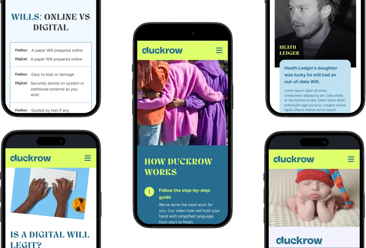
Responsive Design
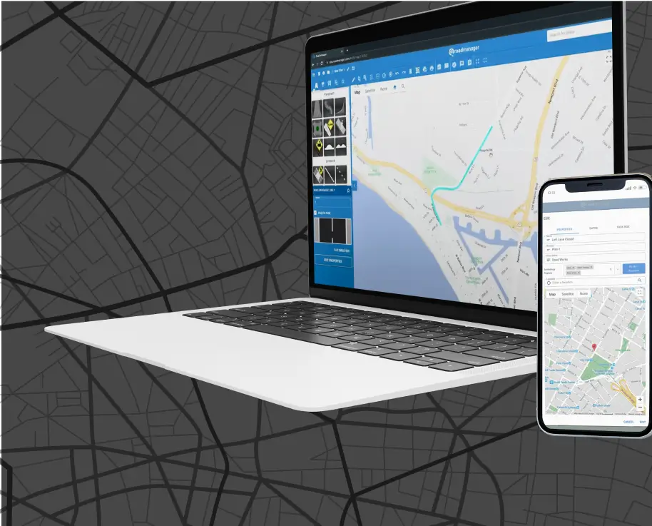
To guarantee that the website functioned seamlessly across a diverse range of devices, we implemented Responsive Web Design (RWD) principles. This approach ensured that the layout, images, and content dynamically adjusted to fit different screen sizes and resolutions, providing an optimal user experience across smartphones, tablets, and desktop monitors.
Search Engine Optimisation
This design was purely a UX/UI endeavour, but that doesn’t stop us from implementing SEO-best practices along the way. Optimal header structuring was implemented throughout.
Conclusion
Focusing on UX, engagement, and conversion is the first step to designing a website. At the end of day, a website is a business asset that is designed to make the customer journey as seamless, intuitive, and enjoyable as possible. A competitor’s website is only a click away.
If you merge these principles with a respect for brand identity, modern aesthetics, and wise technology selections, the result is a website that a brand can be proud of and one that customers return to again and again.
