UX/UI Case Study
The Brief
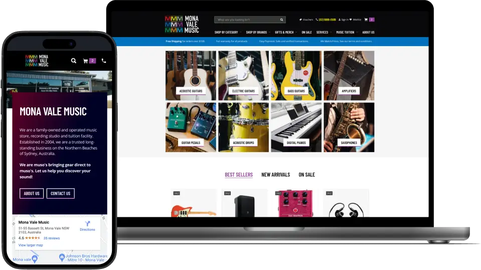
Mona Vale Music is a renowned music store located on the Northern Beaches of Sydney. Their website’s design had dated somewhat, and their conversion rate wasn’t what it should be. We wanted to produce an intuitive and visually appealing design to showcase their wide range of musical instruments, provide easy navigation, accurately represent their brand, and encourage online sales.
The Solution
The primary objective of the project was to design a website and mega menu navigation that enhances the user experience and drives conversions. The website needed to be visually appealing, easy to navigate, and responsive across various devices. The client also expressed the need for a seamless integration of their online store with the website to increase online sales and improve customer experience.
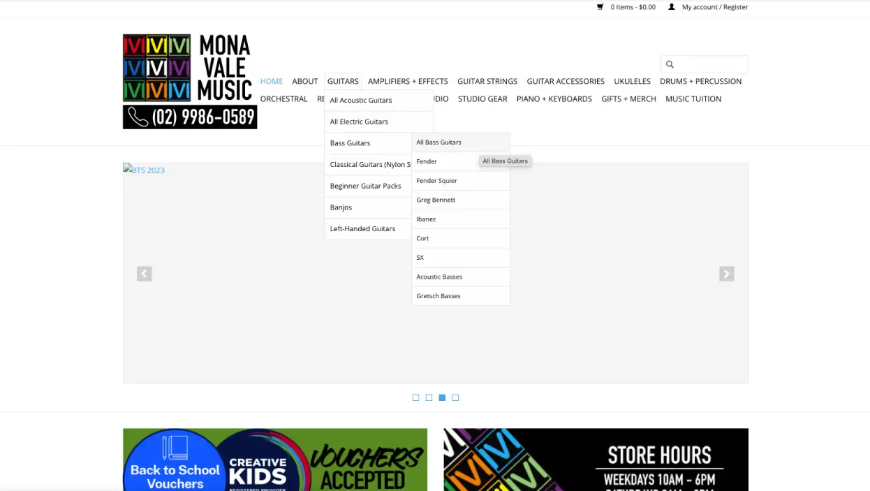
Old
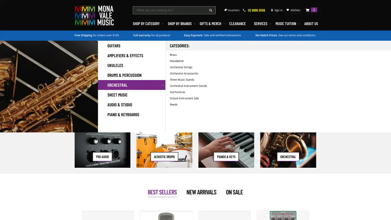
New
Technical UX/UI
The primary goal of the redesign was to make shopping easier and more enjoyable for users. This involved streamlining the search process, enhancing website performance, and maintaining user engagement.
Dropdown Menu
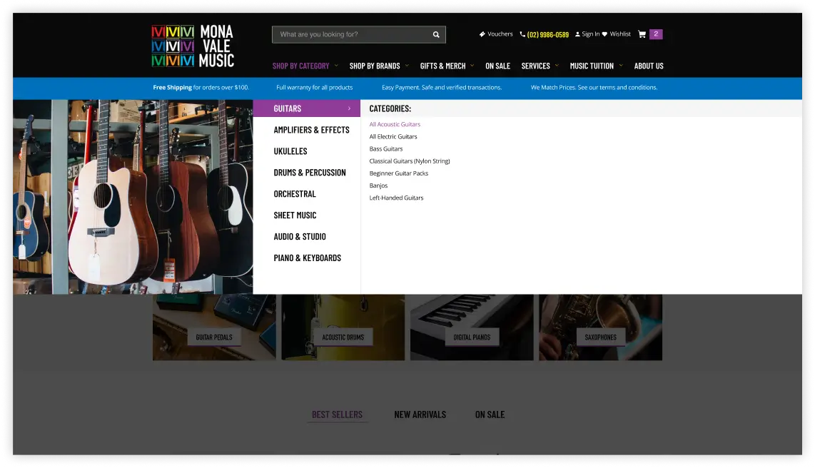
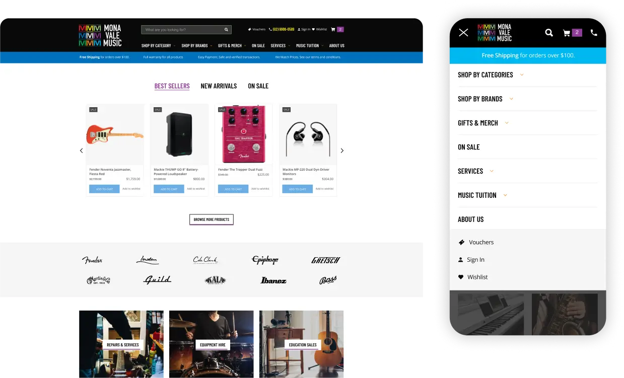
A significant part of the redesign was the overhaul of the main navigation and dropdown menu. We reorganised categories to better reflect user needs and improved the design hierarchy. These changes aimed to create a more intuitive and efficient navigation experience, making it easier for users to find what they’re looking for quickly and effortlessly.
Responsive Design
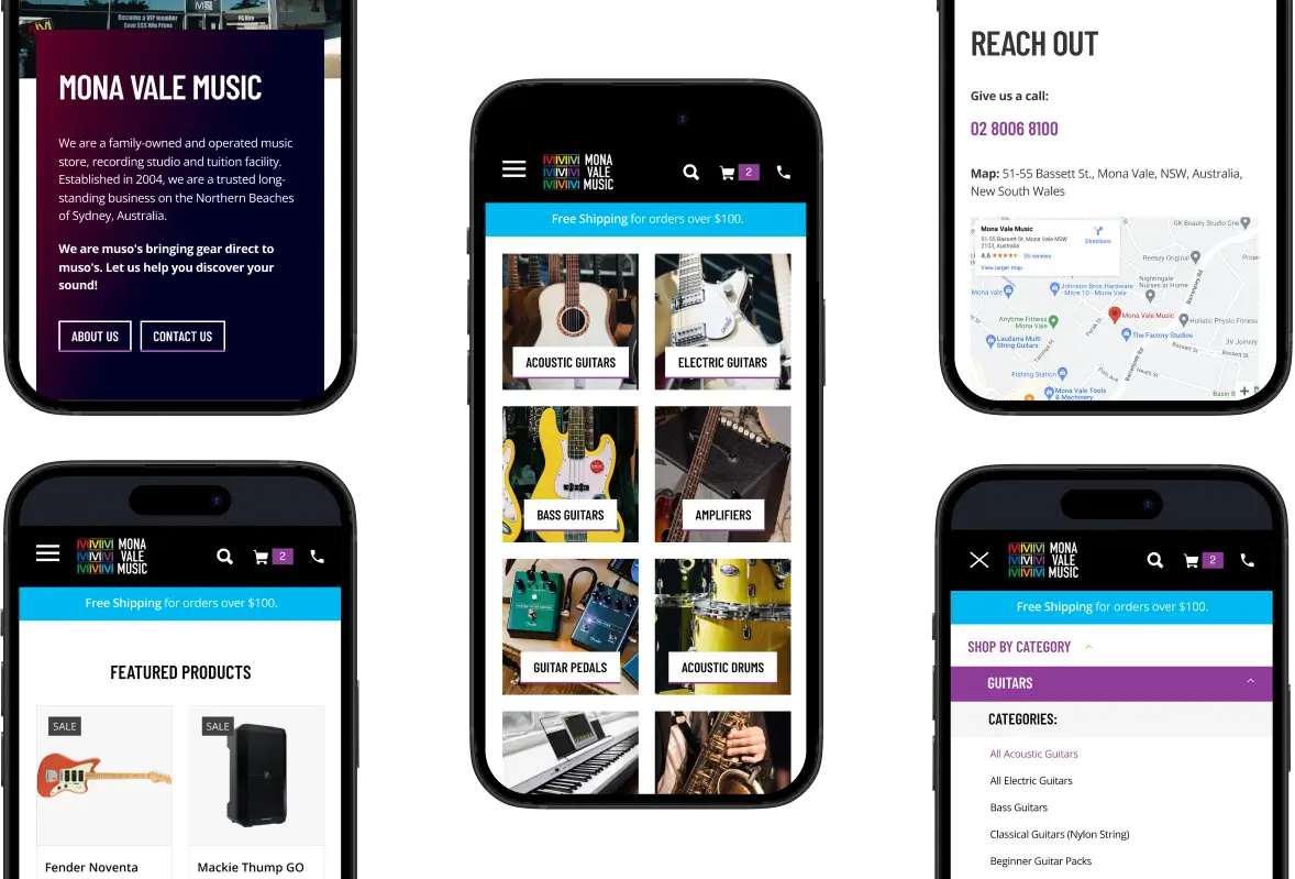
Given that most people shop online using their phones, we prioritised designing for mobile devices. Our focus was on ensuring that the site performs seamlessly on smartphones, providing a smooth and intuitive experience that meets the needs of mobile users.
Search Engine Optimisation
This design was purely a UX/UI endeavour, but that doesn’t stop us from implementing SEO-best practices along the way. Optimal header structuring was implemented throughout,
Conclusion
Focusing on UX, engagement, and conversion is the first step to designing a website. At the end of day, a website is a business asset that is designed to make the customer journey as seamless, intuitive, and enjoyable as possible. A competitor’s website is only a click away.
If you merge these principles with a respect for brand identity, modern aesthetics, and wise technology selections, the result is a website that a brand can be proud of and one that customers return to again and again.
