UX/UI Case Study
The Brief
A well-established business on the Gold Coast, Move Mobility was recently acquired by an ambitious leadership team who set about a full re-brand that sought to celebrate the independence that their products afford those with disabilities. With over 5000 products, ease of in-house maintenance and management was key, so Shopify was chosen as the CMS. The client’s existing website was somewhat dated, and presented a great opportunity for us to elevate their digital presence, customer experience, and SEO performance in one fell swoop.
The Solution
Our designers were tasked with choosing an optimal template that allowed for reasonable design modification to give us the ability to produce a modern and vibrant design befitting of their new brand positioning.
In total, 18 templates were designed that could be used across a total of 5,482 pages.
The Concept
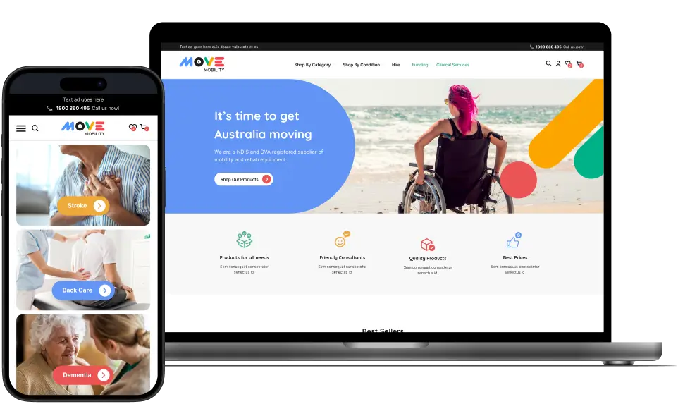
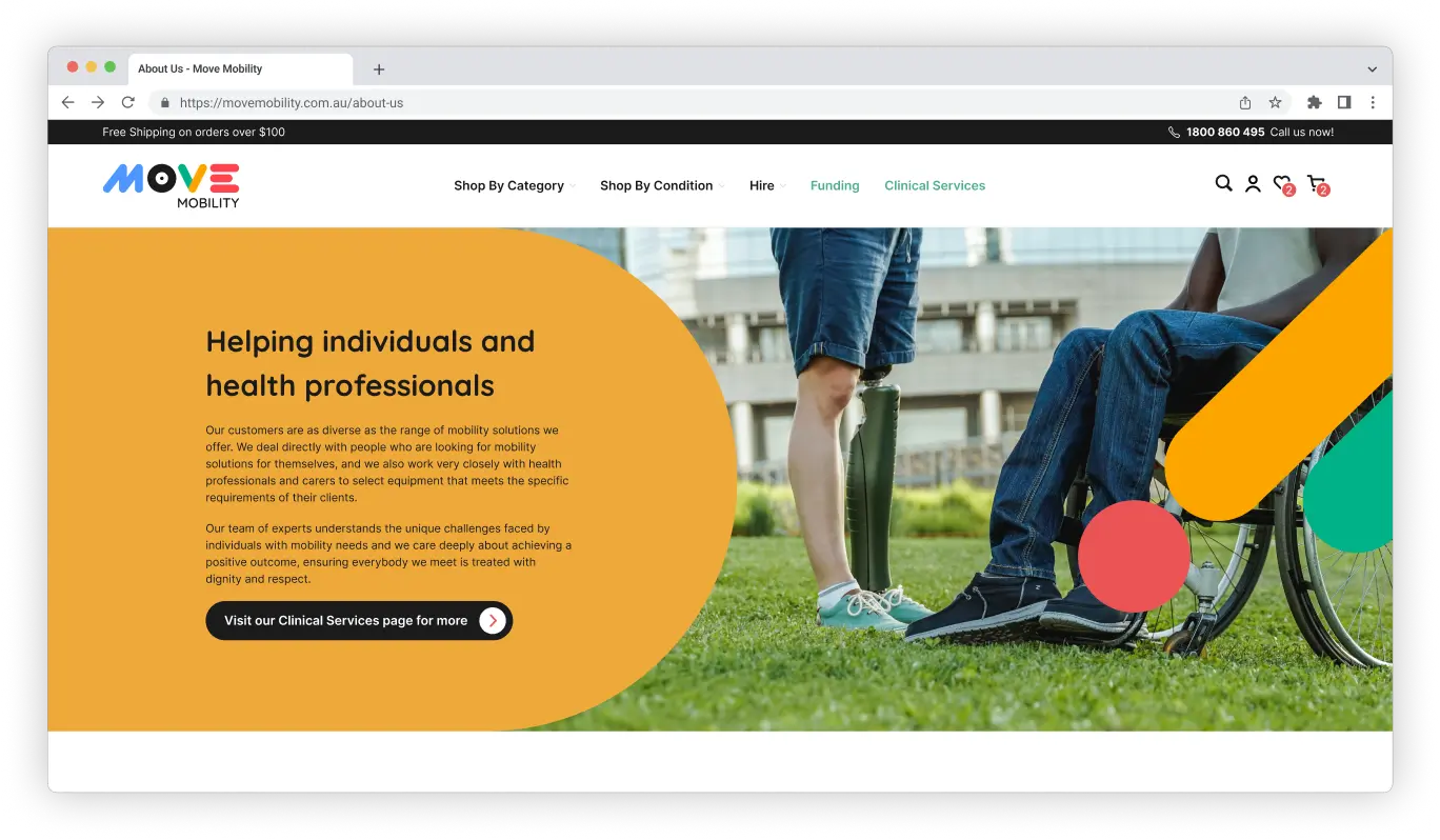
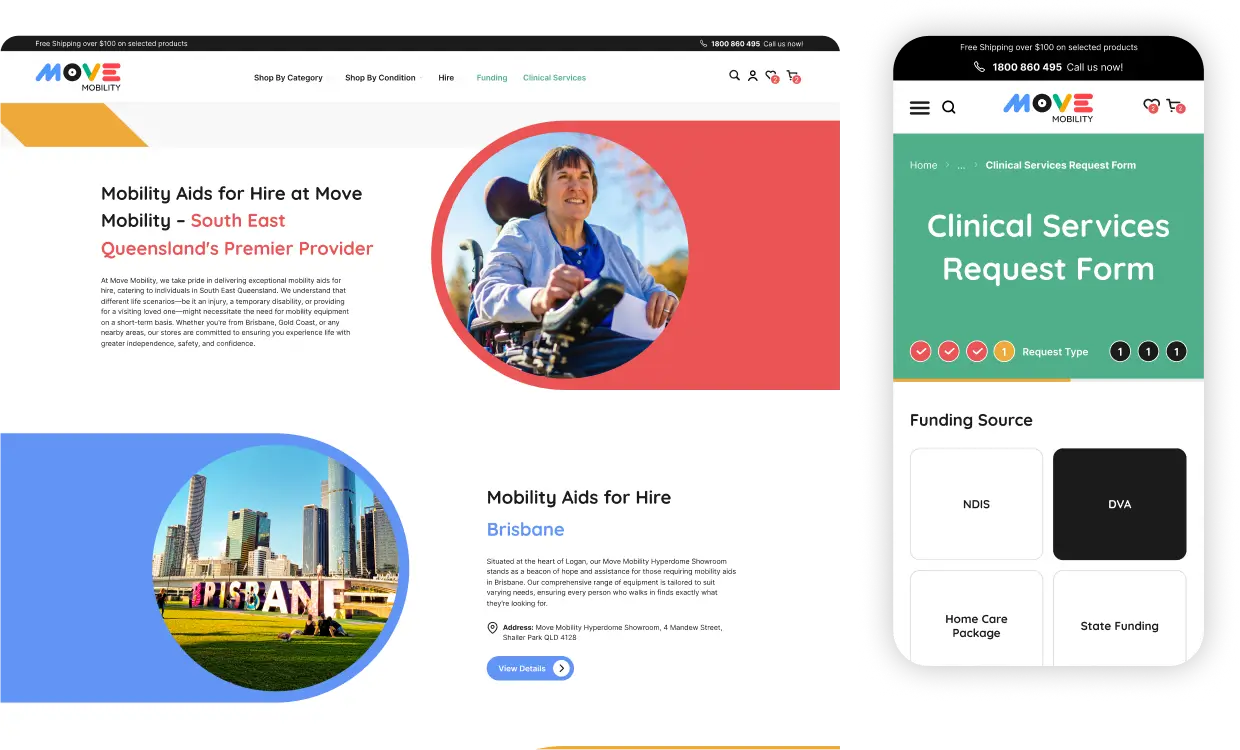
The previous website appeared outdated, but designing the visual elements was straightforward as the client had provided a clear concept. Our primary focus was on the finer details, particularly integrating specific visual features such as curved edges and a variety of colours into the website’s dynamic elements. This meticulous attention to detail ensured that the final product aligned seamlessly with the client’s vision and branding objectives.
Design System
In developing the design system, we recognised that the site would benefit from vibrant visual styles aligned with the new logo, aimed at engaging an energetic audience. We chose a primary style, complemented by several colour variations as secondary options.
Technical UX/UI
The new Move Mobility website incorporated various technical features to enhance user experience and modernise its design. These elements were selected to address customer needs and refresh the website’s overall appearance.
Forms
The website included a custom form for clinical requests. We enhanced it beyond a standard form by improving UI elements and design hierarchy, while considering Zapier’s design limitations.
Responsive Design
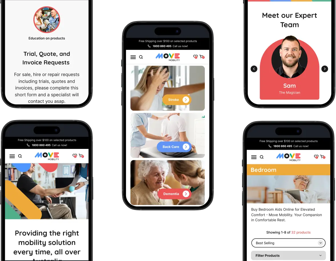
Given the predominance of mobile device use in the digital landscape, we prioritised a design that was both responsive and inclusive, ensuring an optimal experience across all devices.
Search Engine Optimisation
An e-commerce site will normally attract search traffic to its category pages, primarily. These are pages that accommodate broad, non product-specific keywords and are aimed at customers who are in the research phase of a conversion funnel. Full keyword research was performed for these pages, and the client’s own copywriter briefed on how to outperform the competition across Google’s content metrics.
As with all our design and development projects, we devised the on-page information architecture with optimal SEO structuring in-mind, produced optimised meta tags, Schema tags, and alt attributes for images.
We also performed a thorough migration management service, ensuring the current website’s rankings and traffic were safely preserved.
Conclusion
A large, complex e-commerce website demands meticulous attention to the customer journey, technical UX, information accuracy, branding consistency, and SEO setup. This integration of disciplines requires a strategic approach, ensuring every element harmonises to create a seamless, user-centric experience with strong search engine potential.
While Shopify themes can be somewhat rigid in design customization, it’s entirely possible to create a unique and compelling website by focusing on brand strength in key design elements. The result is a website that the client is proud of and that will effectively support their new branding for years to come.


