UX/UI Case Study
The Brief
After conducting some technical SEO work for Starward, we identified significant opportunities in their local service and product sections that had not yet been explored. Our initial keyword and market research revealed several untapped opportunities. We proposed a targeted site expansion to introduce relevant content, aiming to better reach qualified users and improve search engine visibility.
This, of course, would necessitate designing and building these pages, a challenge we were only too pleased to undertake.
The Solution
We often tackle projects where our SEO efforts necessitate designing new pages to enhance both organic traffic and conversions. For Starward, we developed a targeted site architecture and created new pages aligned with our SEO strategy. This involved optimising page load speed, boosting conversions, and introducing copy that was both optimised for search engines and consistent with the brand’s established tone of voice.
The Concept
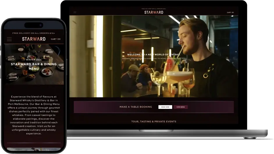
Starward’s got a fresh new website, and we were tasked with giving the user experience a real upgrade. We’ve made it easy for users to spot and understand categories by organising them nicely in each section. Plus, booking a table is now a breeze. These tweaks make navigating the site a seamless experience, from browsing to booking.
Technical UX/UI
Carousel
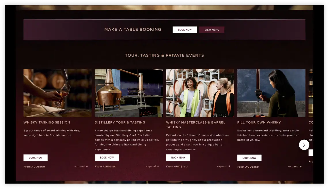
Starward offers a diverse range of categories for their Tour, Tasting, and Private Events. The client wanted these categories to be easily visible and navigable within a single section of the website. Rather than overwhelming users by displaying all the services at once, we designed a carousel that showcases each category. This allows users to explore the offerings in an organised and visually appealing manner, ensuring that all options are easily accessible without cluttering the page. The carousel design not only enhances navigation but also provides a streamlined way to highlight Starward’s variety of services.
Responsive Design
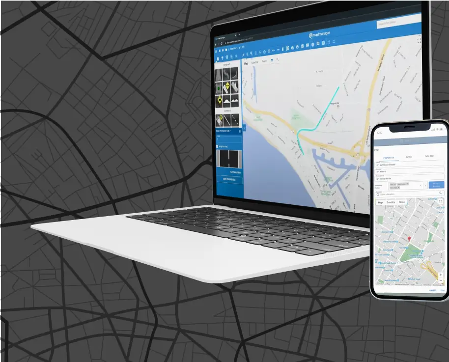
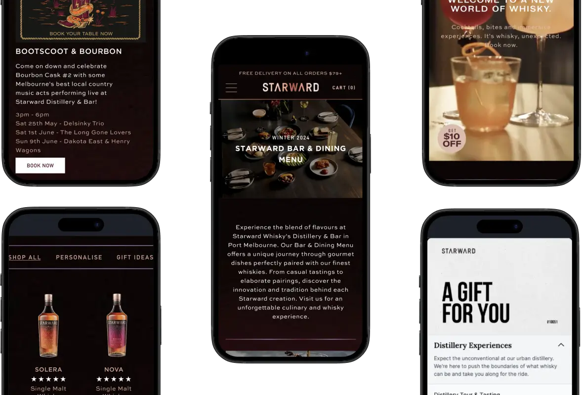
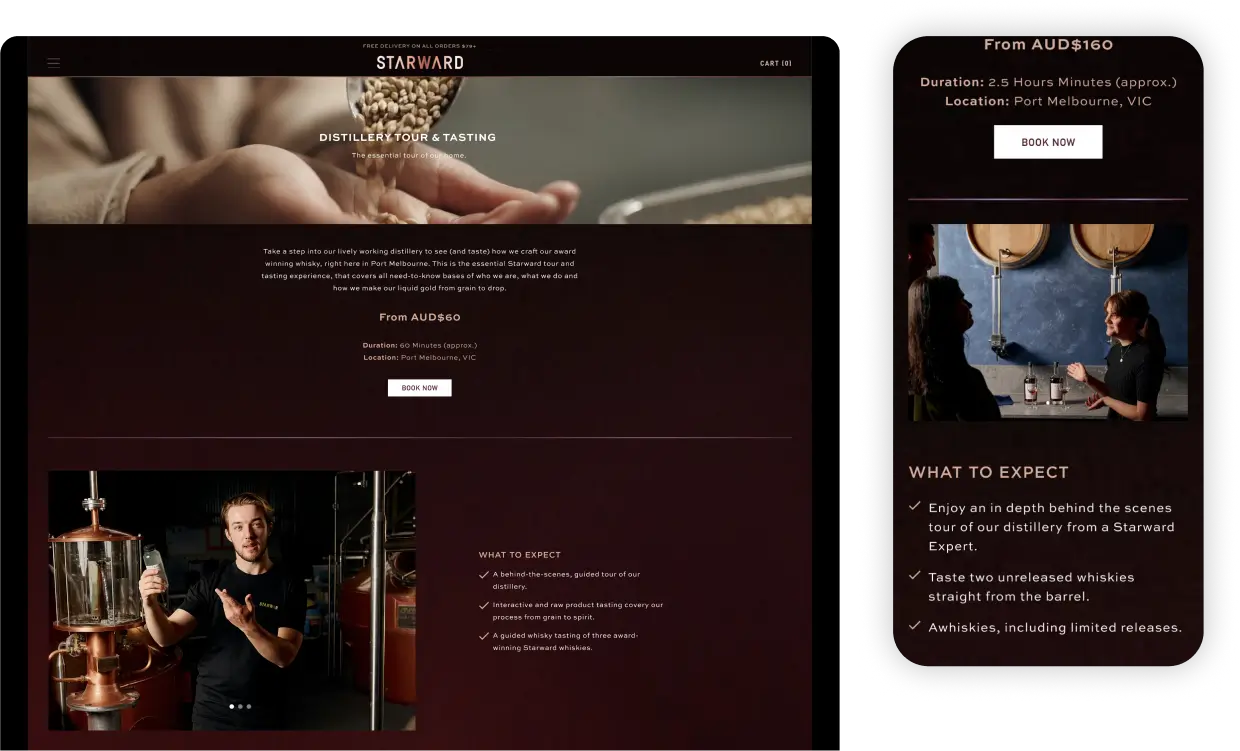
Our design includes a dynamic carousel, large images and videos, and interactive tables, all carefully crafted to create an engaging user experience. To ensure these elements are seamlessly adaptable and scalable across any device, we implemented responsive web design (RWD). This approach allows the website’s layout, images, videos, and tables to automatically adjust, preserving their functionality and visual appeal on any screen size. Whether users are accessing the site on a smartphone, tablet, or desktop, they will enjoy a consistent and user-friendly experience across all platforms.
Search Engine Optimisation
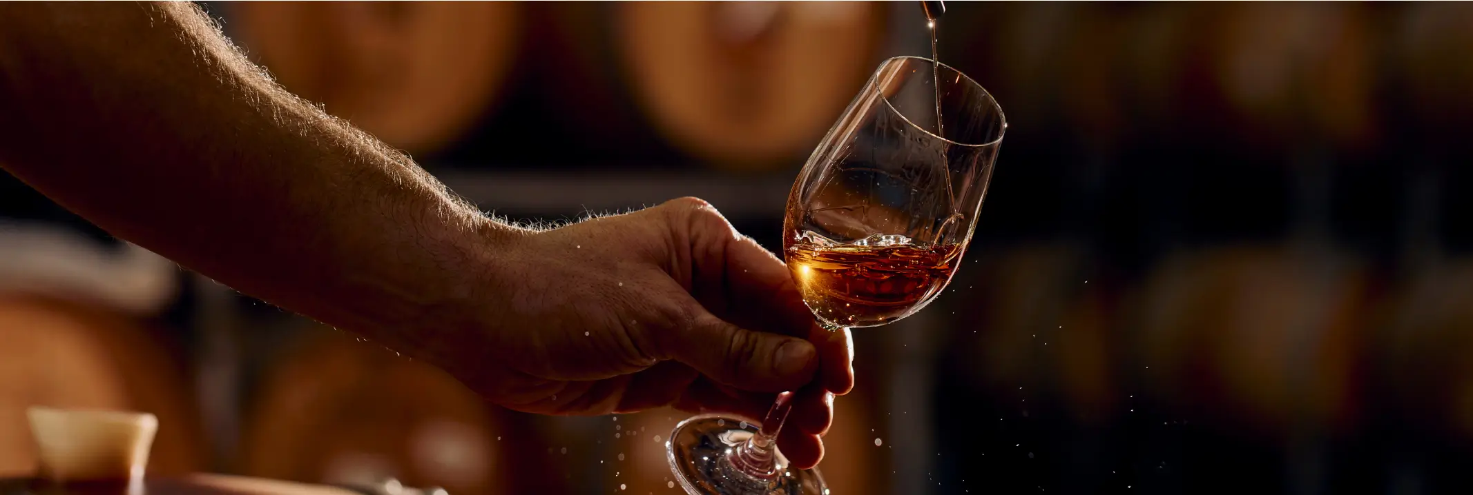
Each new page was designed to capitalise on available SEO opportunities for Starward, a well-known Melbourne distillery offering whisky tastings, tours, a bar and restaurant, masterclasses, and personalised whisky bottles. Local SEO attracts highly qualified customers using high-intent keywords, so we ensured that each page’s content was closely aligned with this target audience.
We adhere to exact technical standards and site speed benchmarks when designing and building web pages. These standards, driven primarily by SEO, also enhance user experience, conversion rates, and overall brand perception.
Conclusion
Through targeted site expansion and a strategic SEO approach, we enhanced Starward’s digital presence by developing new pages optimised for both search engines and user experience. By refining the site’s architecture, improving load speeds, and crafting SEO-friendly copy, we significantly boosted organic traffic and conversions. The introduction of a dynamic carousel and responsive design ensured a seamless and engaging experience across all devices, making it easier for users to explore services and book tables. These improvements have positioned Starward to better reach qualified users and maximise their online visibility.
