The Crucial Importance of Responsive Web Design
The significance of a responsive website has become a foundational pillar in today's digital realm. As more people access content from various devices, web designers face the challenge of ensuring a consistent experience regardless of screen size. With most global internet traffic flowing from mobile devices, a mobile-responsive website is no longer a luxury—it's a necessity.
Businesses that don't adapt their business website to both mobile or desktop site demands risk fading into datedness. Responsive websites aren't just industry buzzwords—they represent the future of mobile design and are crucial for capturing and retaining digital audiences.
What Is Responsive Web Design?

And why do we need a responsive web design?
Nowadays, internet users are constantly connected across many devices, so websites must be versatile and user-friendly.
Here's where Responsive Web Design (RWD) steps in.
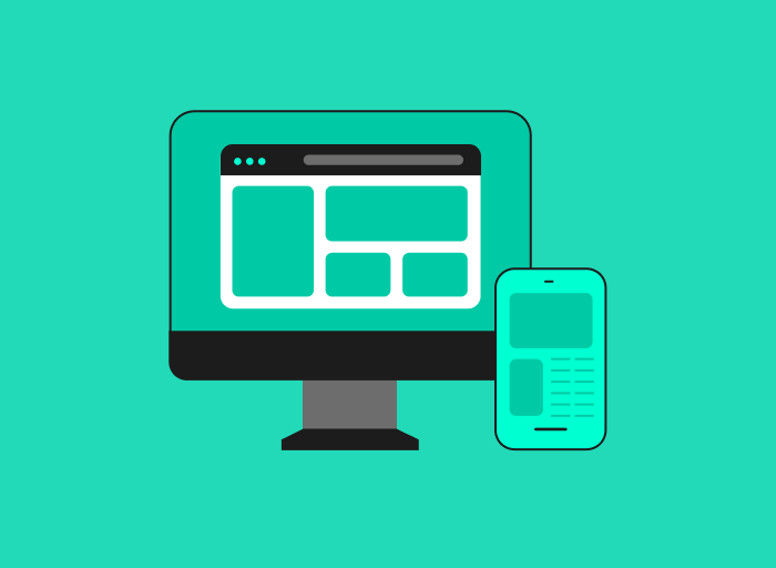
Responsive web design is a holistic approach that ensures that every element of a website—from its layout to its images, from its typography to its buttons—fluidly adjusts and reconfigures based on the device it's viewed on, for example, mobile devices. Think of it as water taking the shape of its container, whether a tall glass or a wide bowl.
Similarly, a responsive website moulds itself to fit the screen size, be it a large desktop monitor, a tablet, a mobile phone, or even the increasingly popular smartwatches.

The magic behind RWD lies in three core components:
Flexible Grids
Traditional designs relied on fixed widths. Responsive designs, on the other hand, use relative units—like percentages. So, instead of having a rigid layout that might look off on smaller screens, it fluidly adjusts to fit just right.
Scalable Images
A picture might be worth a thousand words, but it shouldn't slow down a website. In RWD, images scale. They grow or shrink to match screen size without compromising the site's speed or design.
CSS Media Queries
These are the backstage technicians of responsive design. Through them, a website can detect the size of a viewer's screen and tweak its layout to offer the best view. It's like having a wardrobe that automatically picks the best outfit depending on the occasion.
In sum, responsive web design is more than just fitting screens and resizing images; it's a new approach to design. In an era where device diversity is growing, it's a solution that ensures websites are functional and consistently delightful across all platforms.
Why Is Responsive Web Design Important?

RWD ensures that web pages function seamlessly and look visually appealing across various devices and screen sizes, from desktop monitors to smart phones. The imperative for adaptable design grows as more users transition to mobile browsing. Beyond aesthetics, it is about offering a consistent, intuitive, and user-friendly experience to everyone, irrespective of their mode of access.
Dive into the expansive landscape illustrating the importance of a responsive website:
1. The Mobile Revolution
One of the many benefits of a responsive web design is mobile responsiveness.
Smartphones and tablets have changed the way we use the internet. As of 2022, an estimated 5.3 billion unique mobile internet users, signifying that over 60% of the world's online population accessed the internet via mobile devices.
Remember when desktops were the norm? Now, they share the stage with mobile in a dynamic digital world. It's not just about user numbers but their expectations. Mobile users demand quick load times.
Data shows that 53% leave a site if it takes 3 seconds or more to load. This highlights the need for a mobile responsive design. Brands must have sites that look good and work efficiently on mobile.
2. User Experience Matters
Every site aims to offer a stellar experience to its users. However, 88% of them might never return after a poor encounter. Such figures stress the importance of a solid user experience (UX).
Responsive design steps in by tailoring to the viewer's device, ensuring smooth content display—whether on laptops, tablets, or smartphones. It reduces bothersome zooming and scrolling. In essence, top-notch UX boosts user engagement, builds trust, and encourages higher conversion rates.
3. SEO Benefits
In the digital realm, visibility is currency. And in this domain, Google reigns supreme. A testament to this is Google's clear stance on mobile optimisation—it's not just preferred; it's imperative.
As user behaviour shifts towards mobile, Google's algorithms have evolved to prioritise mobile-friendly sites. But it's not just about the mobile experience. Responsive web design eliminates potential SEO pitfalls like duplicate content—a challenge often encountered when brands maintain separate sites for desktop and mobile.
A responsive design ensures content consistency, bolstering SEO efforts and improving search engine rankings.
4. Cost-Efficiency
In business, efficiency often translates to profitability. When it comes to web design, the allure of having separate designs for desktop and mobile might seem tempting, but the long-term implications are hefty—both in terms of time and finances.
Responsive web design presents a solution that encapsulates the best of both worlds. By investing in a single, fluid design, businesses can ensure a seamless user experience across devices.
Although the upfront costs might be more than a traditional design, the subsequent savings in maintenance, updates, and the potential uptick in conversions due to improved UX make it a wise investment.
5. Improved Conversion Rates
The primary objective of most websites is conversion—be it sign-ups, sales, or any other action. A significant determinant of conversion is the site's UX.
Simplified: exceptional experiences lead to more conversions.
Responsive designs prioritise user-centric elements. For instance, call-to-action buttons are strategically placed and are easily clickable on mobile devices, forms are streamlined for quicker inputs, and the overall navigation feels intuitive.
When a user's journey on a site is frictionless, the probability of them taking the desired action multiplies.
6. Google's Mobile-First Indexing
In 2019, Google made a significant change: mobile-first indexing.
How does this impact websites? Google mainly uses the mobile version of a site to index and rank it. Websites not optimised for mobile could lose both visibility and potential customers. Responsive web design fits this change well, ensuring content looks good and works well on all devices.
7. Future-Proofing
Predicting the trajectory of technological advancements is similar to gazing into a crystal ball. While certain trends are discernible, the specifics are often shrouded in uncertainty. Today's popular devices might become obsolete and replaced by newer innovations.
However, responsive web design offers a semblance of certainty in this ever-fluctuating landscape. Ensuring that a site's design can adapt to diverse screen sizes and resolutions guarantees a level of future readiness. As technology evolves, the website stays resilient, adaptive, and user-centric.
Additional Benefits: Speed and Analytics
With responsive design, websites can be optimised for speed on various devices, which is especially important for mobile users who expect sites to load quickly. Moreover, having one consolidated site makes it simpler to track user journeys, funnels, and conversion paths using analytics tools.
The Importance of Professional Design
Crafting truly responsive sites goes beyond superficial adjustments. A professional website designer with expertise in Responsive Website Design ensures that the site balances aesthetics with functionality. Their deep understanding of user behaviour, combined with the latest design principles, guarantees a better user experience.
Conclusion

Why is responsive web design important?
The digital realm is a dynamic entity, continually shifting and evolving. Amidst this flux, one constant remains: the need for adaptability.
Responsive web design isn't just about aesthetics or user experience—it's about business sustainability. A responsive design ensures businesses remain relevant, reachable, and resonant today.
Reach out to professional web designers to implement a successful website for your business.


